Increasing signups by 74% on the onboarding platform by fixing user experience!
Growing a company from 0-1 as a Solo Product Designer with less than 1 year of experience!
My first ever project, where I have worked as a solo designer and individually contribute in building the designs for the product and features along with building a great design system. In this project I help the organisation grow from 0-1 while improving their signups rates to grow by 74% along with multiple metrics improved.
CONTEXT
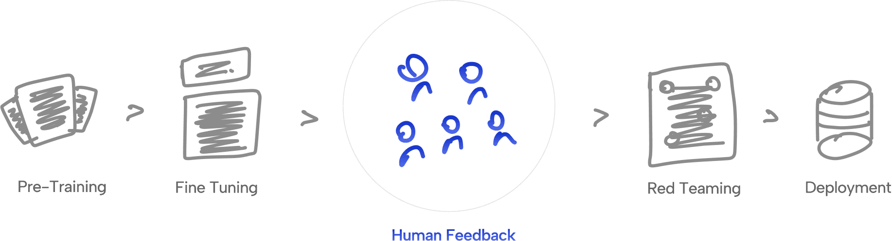
Humans make AI smarter!
In training AI, humans play a big role by giving feedback that helps it learn, improve, and make smarter choices.
Mission
and Soul AI is building a large pool of talented humans, ready to be deployed whenever needed to train AI.
As we need Humans to train AI, Soul AI core mission is to create a pool of humans which are professional at their work starting from India and expanding to the globe.
Existing Product & Flow
From understanding their business model to understanding their goals from the product!

Screenshot of the MVP that we were using to test the idea.
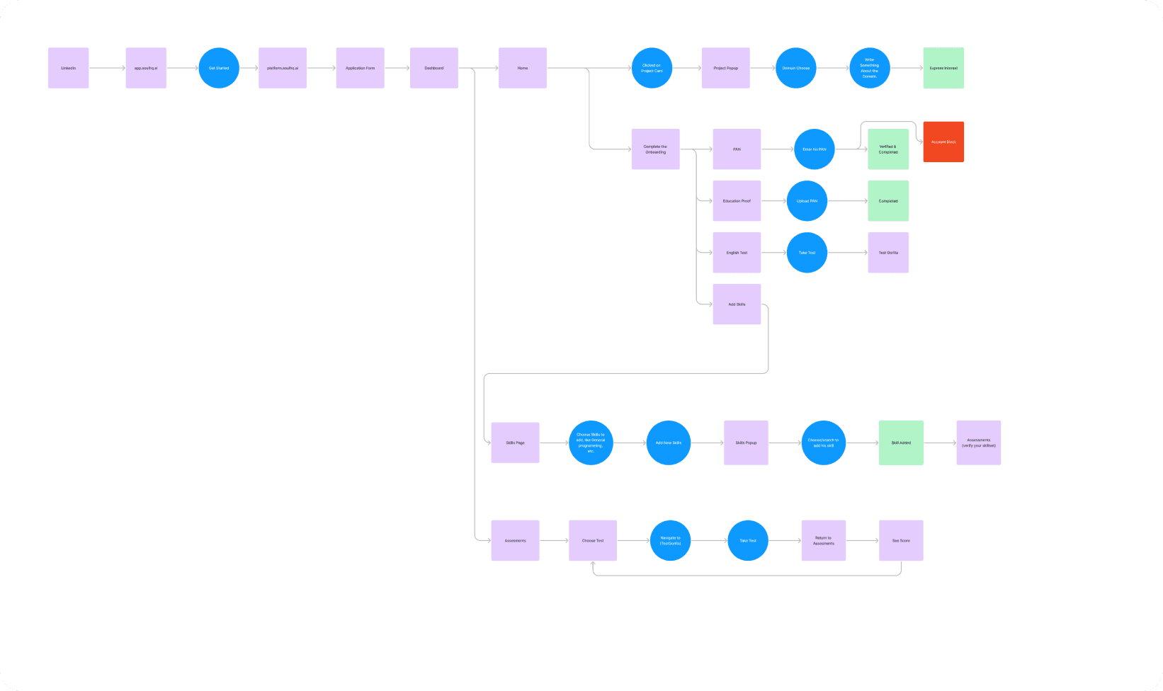
Understanding the flow of the product and to be able to fix it
Objective
Building a platform for filtering out the best human talent!
Our core objective is to create a product that can support the shortlisting team in getting the best human talent that can be deployed on to the client's project.
Research & Findings
We did competitive analysis & market research and found solutions for our major 3 problems.
We analysed platforms which were confidential to us through various sources and find out what's been working in the market and also in the research we got the solution to our 3 major problems which are:

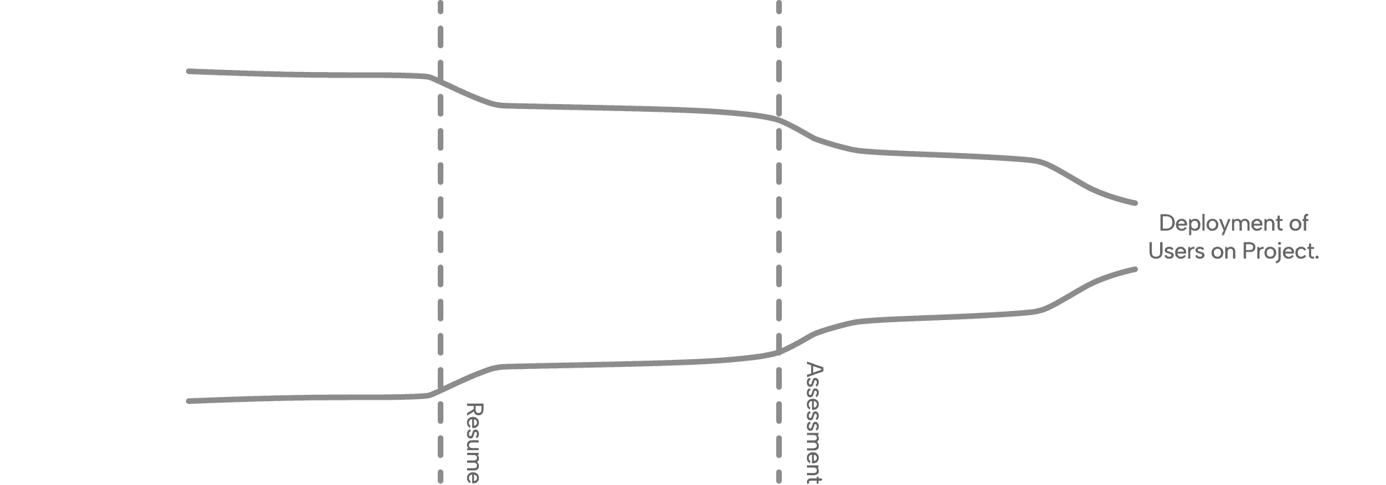
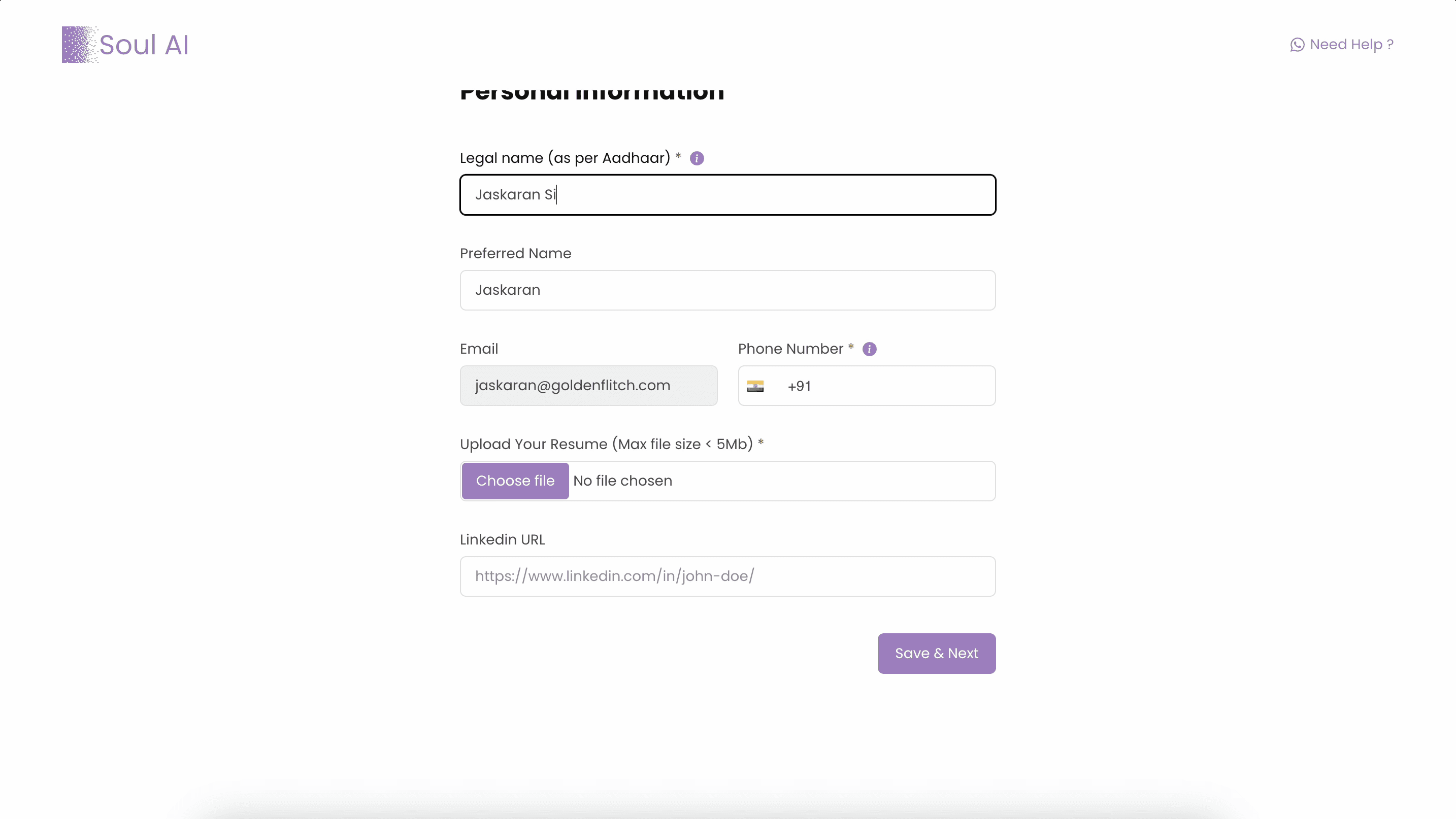
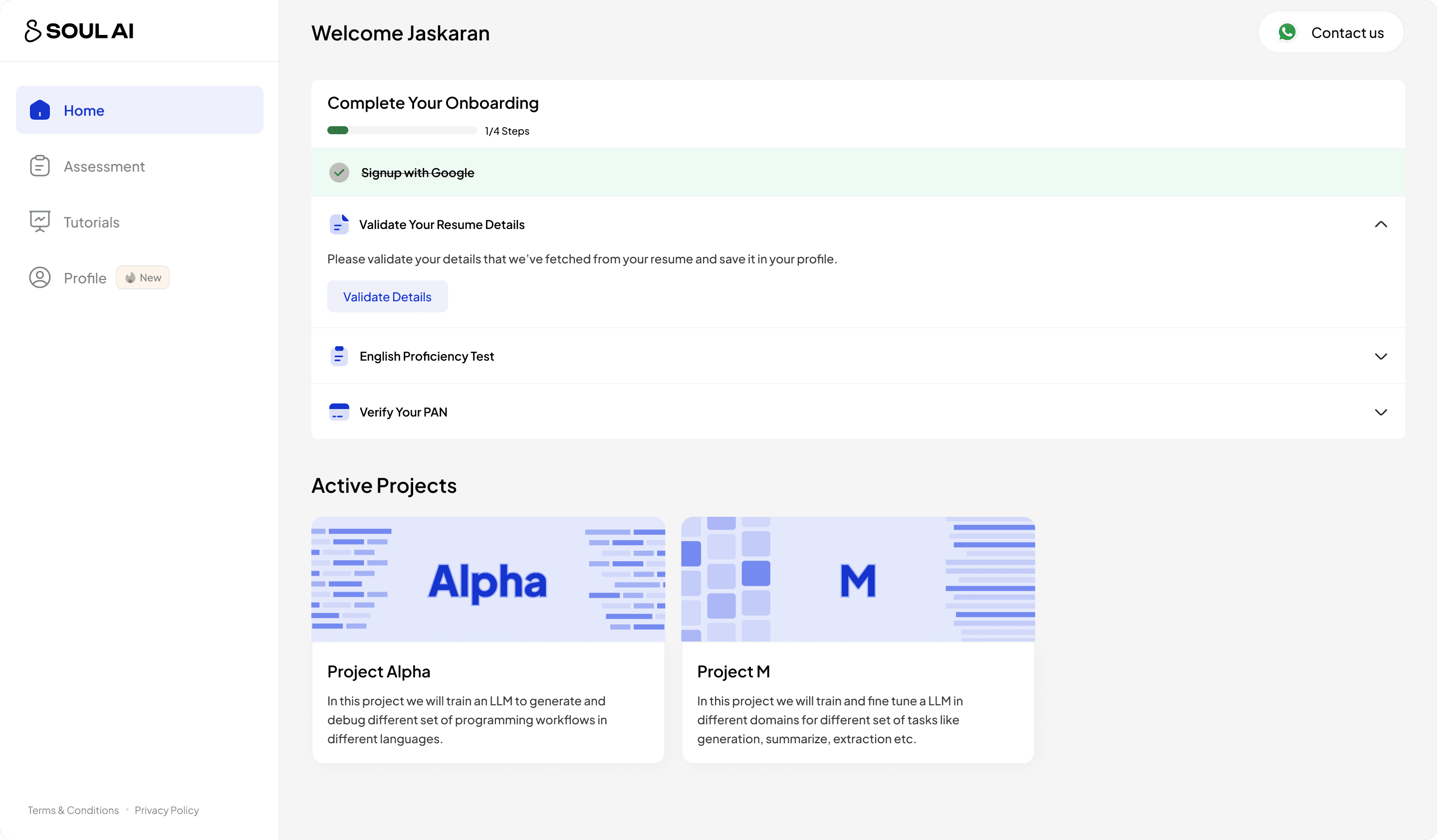
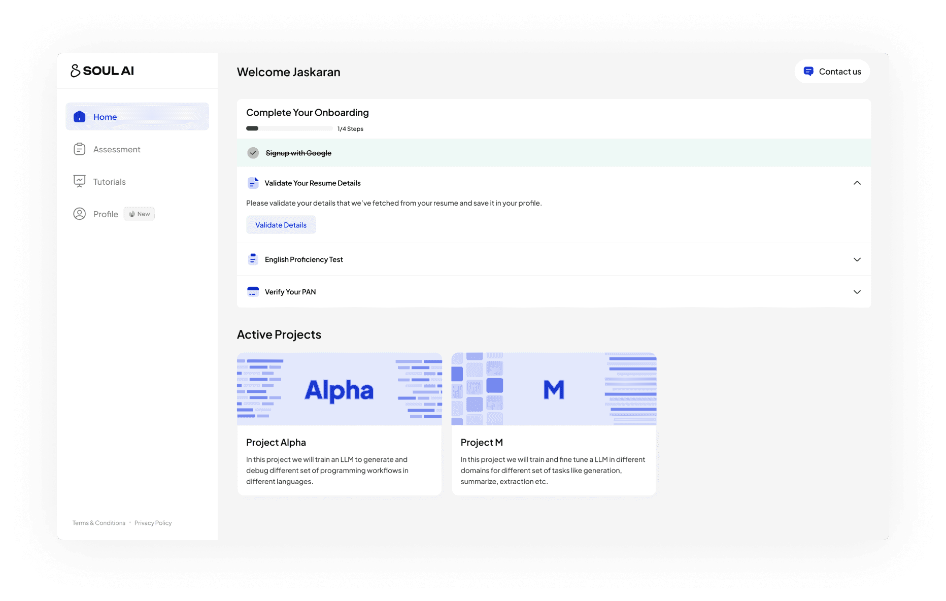
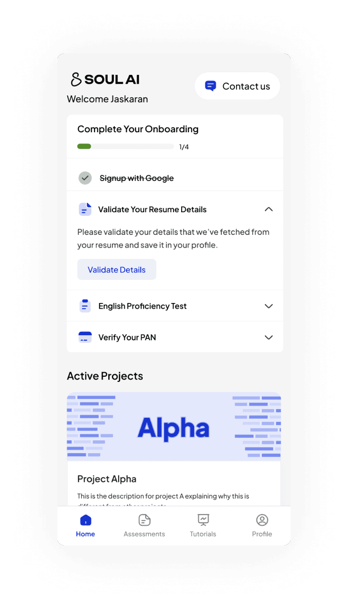
Making Onboarding Faster!
1) Using AI to capture details from resume, reducing onboarding from ~3 mins to 1 min.
Old Onboarding
Previously, we were asking user to fill in all kind of details that were not only useless for the shortlisting team but also very time consuming for users to fill.
Problems
1) Takes ~3 minutes to complete
2) Lack of hierarchy in content
3) Capturing useless details
New Onboarding
Now, I tried to break things down as of priority and asking for the details at the right time, removing anything that's not useful for the shortlisting team
Improvements
1) Takes less than 1 minutes to complete
2) Asking details at right time
3) Using AI to pre-fill the details.
Better Experience
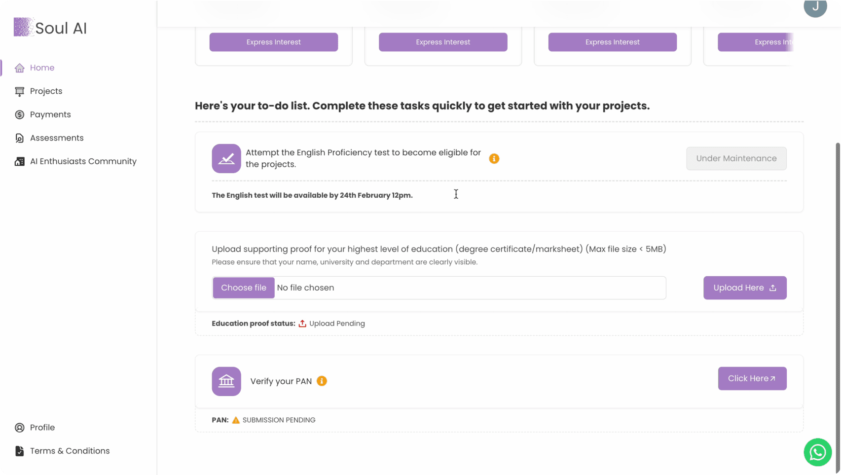
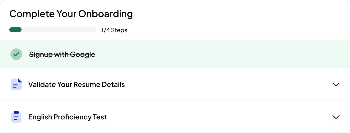
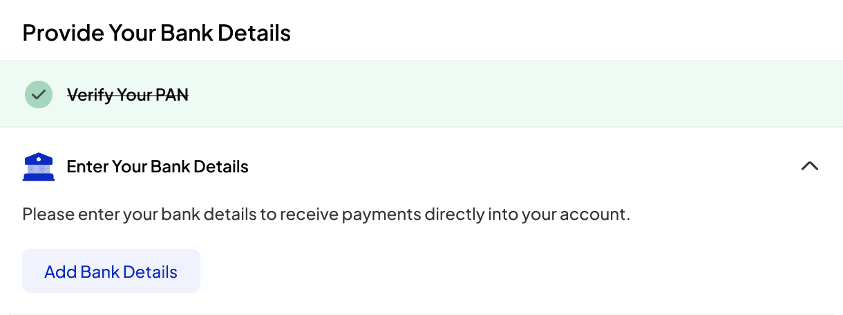
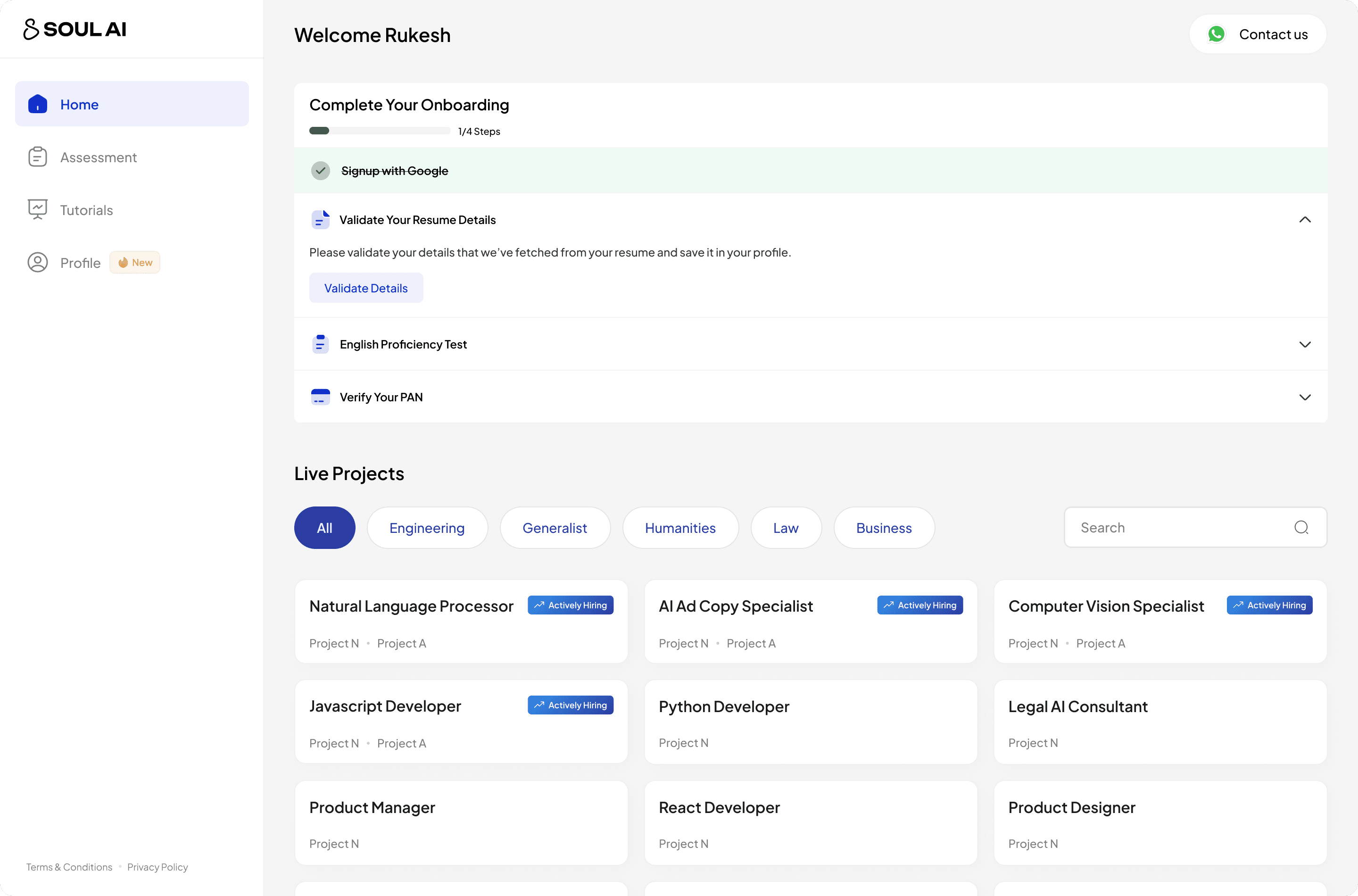
2) Adding ToDos to guide users
Old Todos
Previously, we have some tasks that we call Todos and we ask the users to complete them, but it was not action oriented and user can easily skip those!
Problems
Easily Skipable
cluttery & Lacks Actionable Visuals
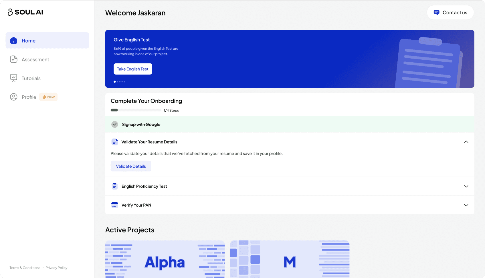
New Todos
Now, I tried to make the todos much easy to digest for the users. As a new user you'll know these are the things you should do to get started with project application.
Improvements
1) Visual Prominence
2) It's much more Scalable
3) Leads to 60% increase in Todos completion
Todos for new users
Todos for shortlisted user
Better Experience
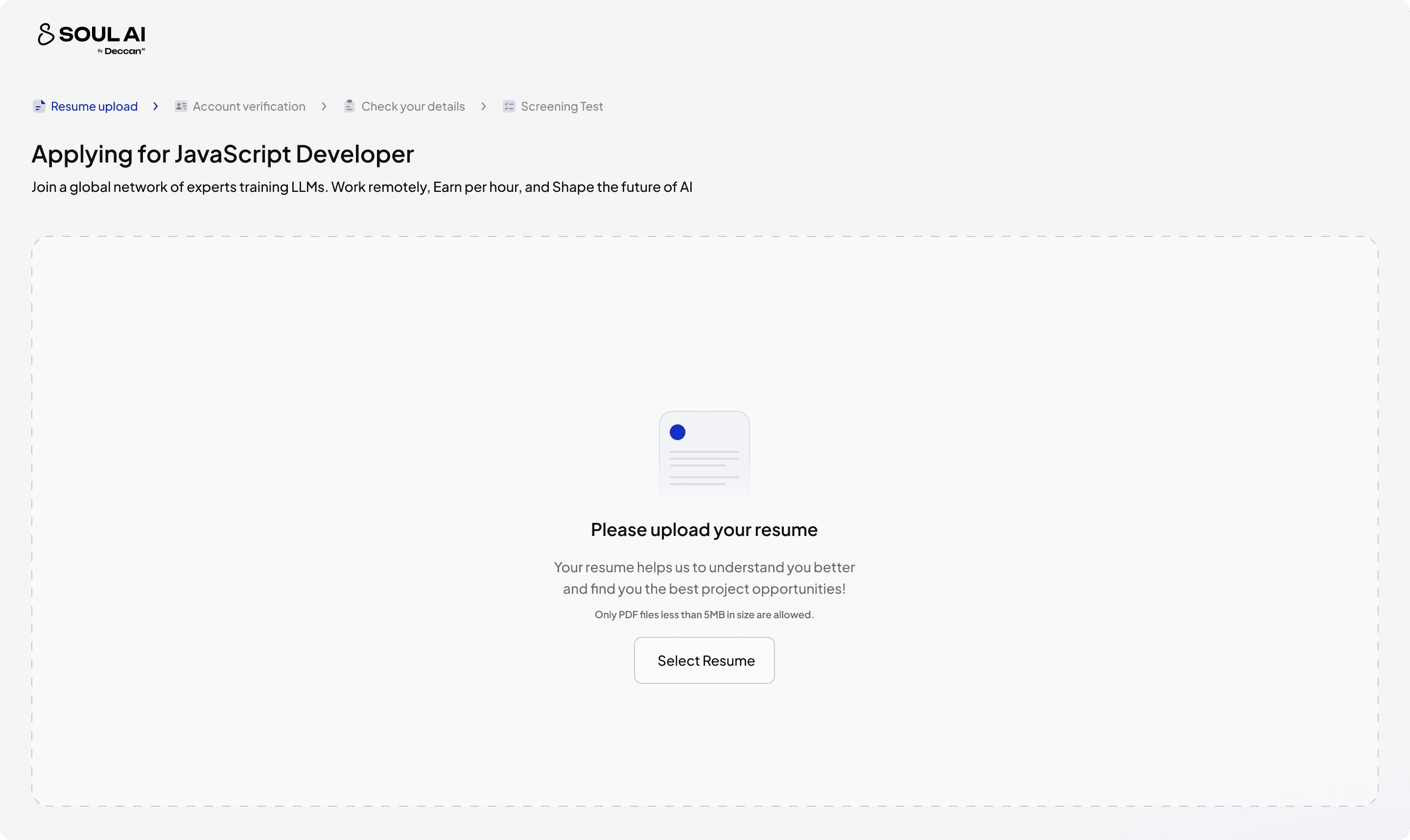
3) Revamping complete experience for Expressing Interest in our Active Projects.
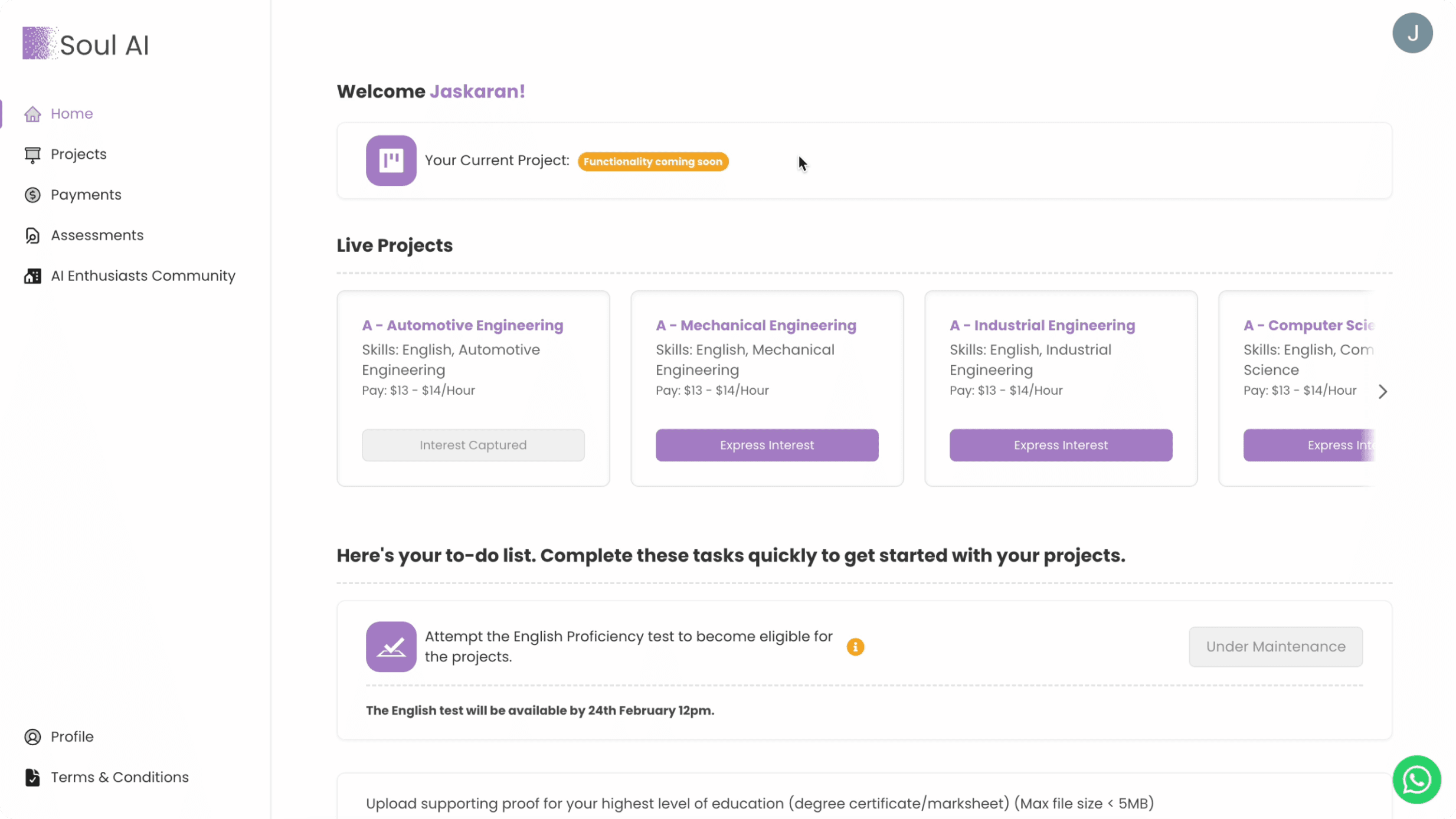
Old Card (Jobs)
Previously, we have card for jobs that we need for a particular project and we list them on our platform and there the user comes up and express their interest in their field of interest but when it comes to visual design it was not at all scalable with the horizontal scroll
Problems
Horizontal scroll
Lacks visual Hierarchy in the card
First Version: Jobs Cards
Then, we tried to make a cleaner version for jobs where you can see all the jobs with attached Tags to filter out the jobs according to user's field of interest and a search bar to search and see if a particular job is there.
Problems
1) Difficult to manage by the team, as of ATS software
2) Hard to update the status for new projects
3) Not explaining anything about the projects
Final Version: Project Card
Now, after talking with the internal team we've come up with the project cards while removing jobs cards all together, as our shortlisting process match the candidates with the project not jobs, also it's very easy for the team to manage the project than jobs.
Pros
1) Aligns with our shortlisting process
2) Easy to manage from the ops team
3) Aligns with the future vision of the product.
4) Explains about the Project and It's working
Cleaner View for Desktop & Mobile
Projects cards made the design much cleaner for mobile view!
Better Experience
4) Introducing a brand new process that helps in shortlisting the best candidates for the particular skill needed.
Signup
Onboard
Express Interest
Waits
Signup
Onboard
Express Interest
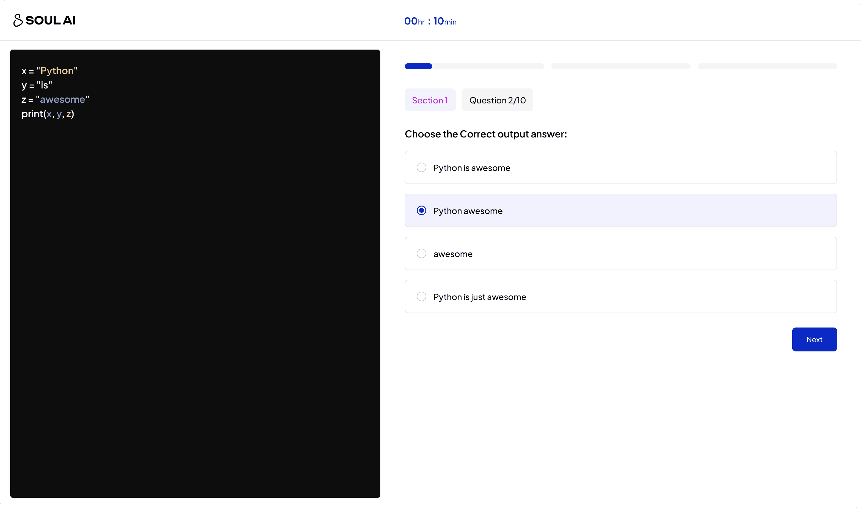
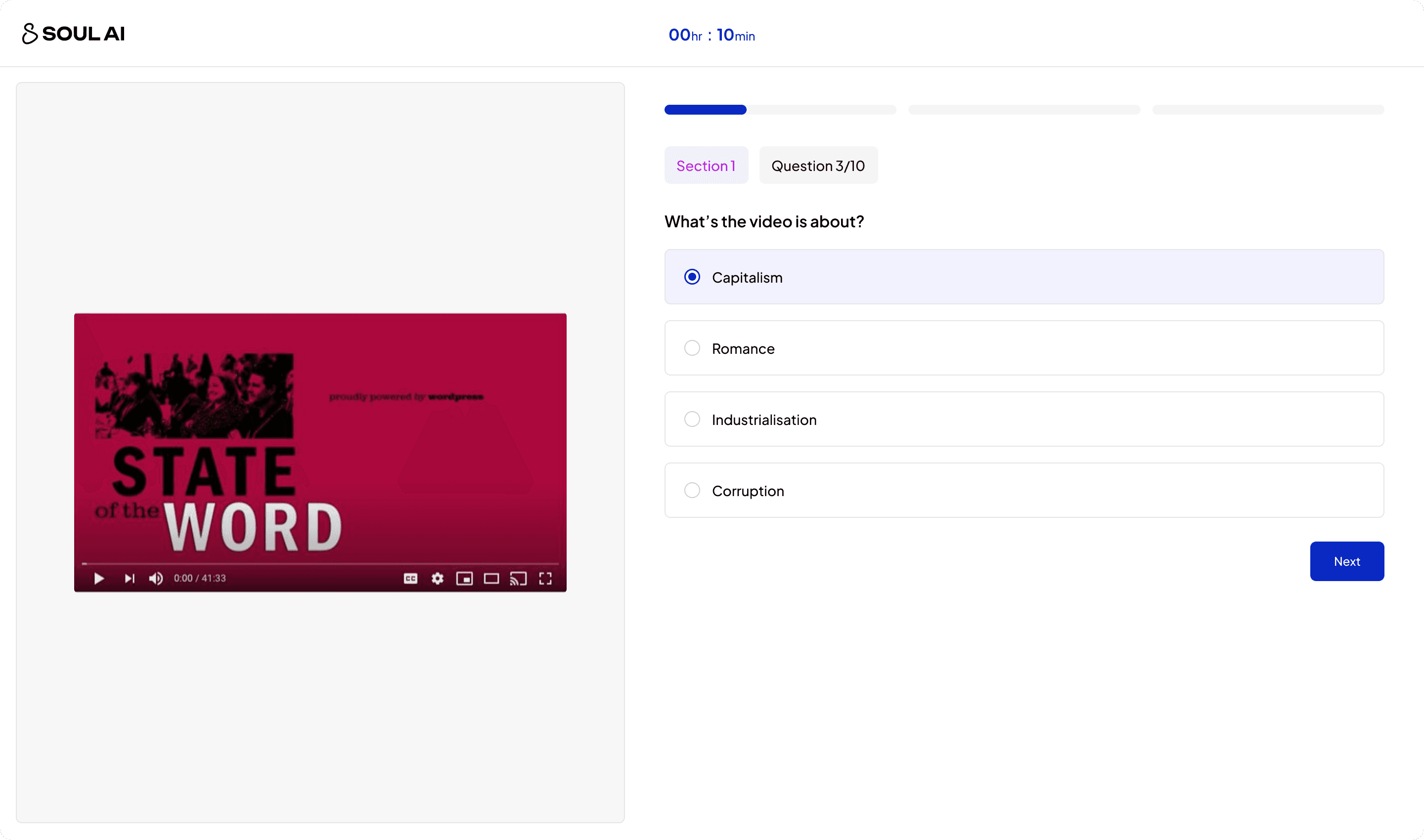
Prove Your Skills
Prove your skills with Assessments
MVP: Consisting of many fields and more than 3 pages, asking a lot of details that was not even required for the internal team.
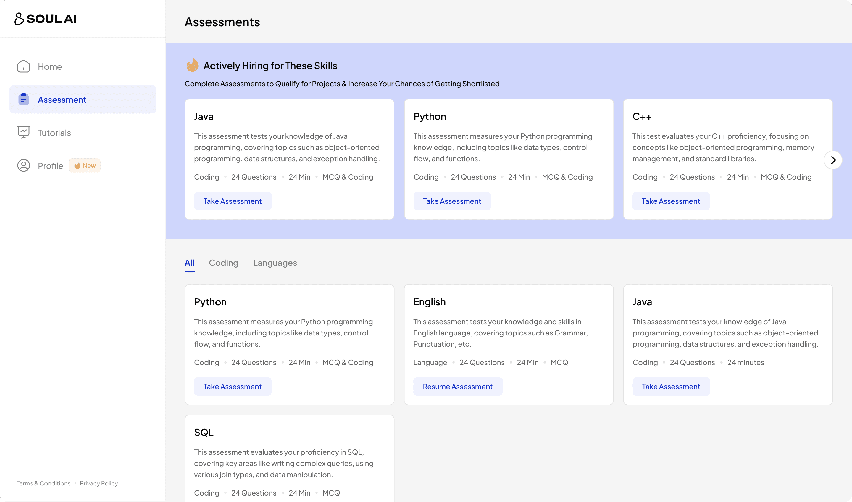
Benefits
Instead of just waiting, users can prove their skills
Filter out users with low intents, keeping ones we care.
Adds up a filtering layer to the shortlisting process
Designed Platform for Multiple Use Cases!!
From coding to video, Designed a platform for scalability!

Better Experience
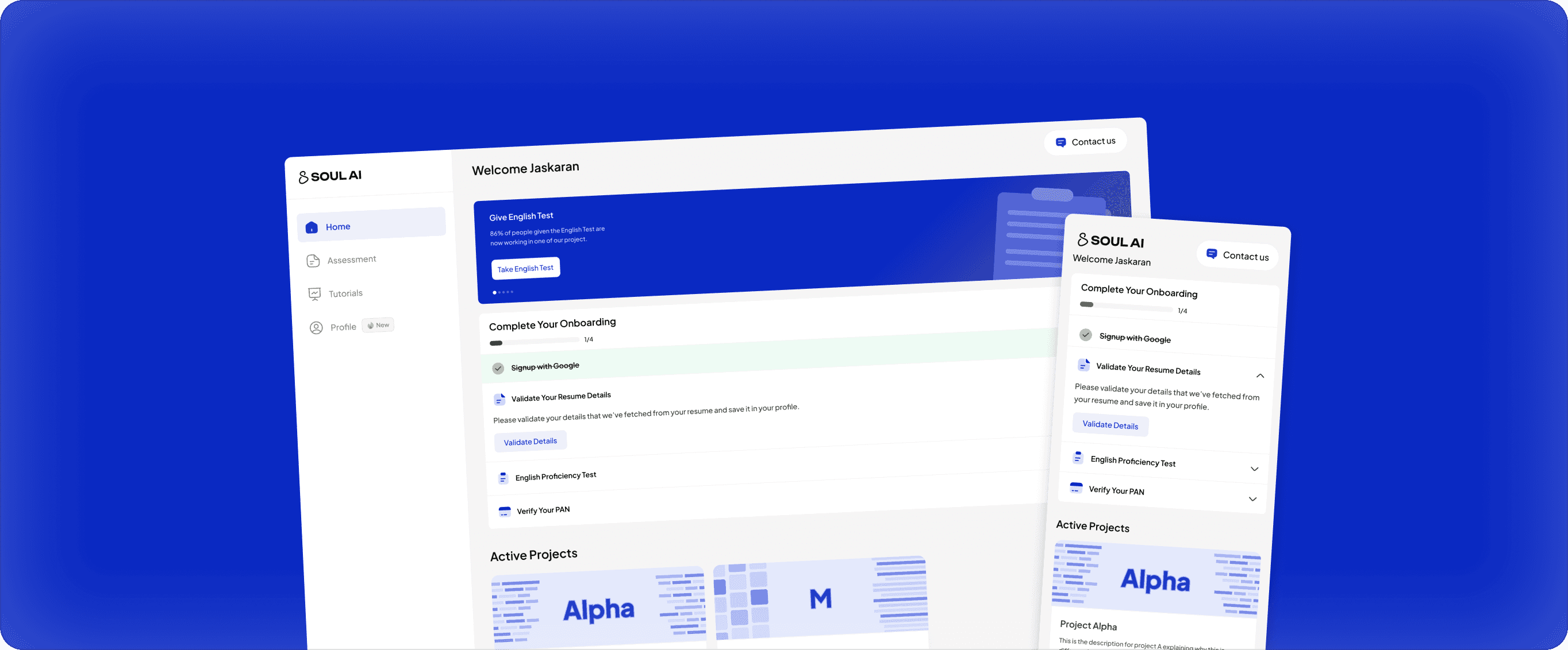
5) Building a Dynamic Profile where the user can add and edit their details that we fetched from their resume.

Problem:
Users was not able to update their details, which was leading to many support tickets.
Solution:
Having a profile page like other Job platform where the user can update their details easily.

Old Profile Page
Previously, we just have a single screen profile page that is just to view your details, you can't even edit or update the details and this was frustrating for users.
Problems
View only Profile Page
Not showing all details of users

New Profile Page
Now, We have tried to show all the details that we're able to fetch from the resume using AI parsing and all the details are divided based on categories.
Improvments
1) A digital resume that user can update easily
2) Reduce tickets for profile queries by 64%
Better Experience
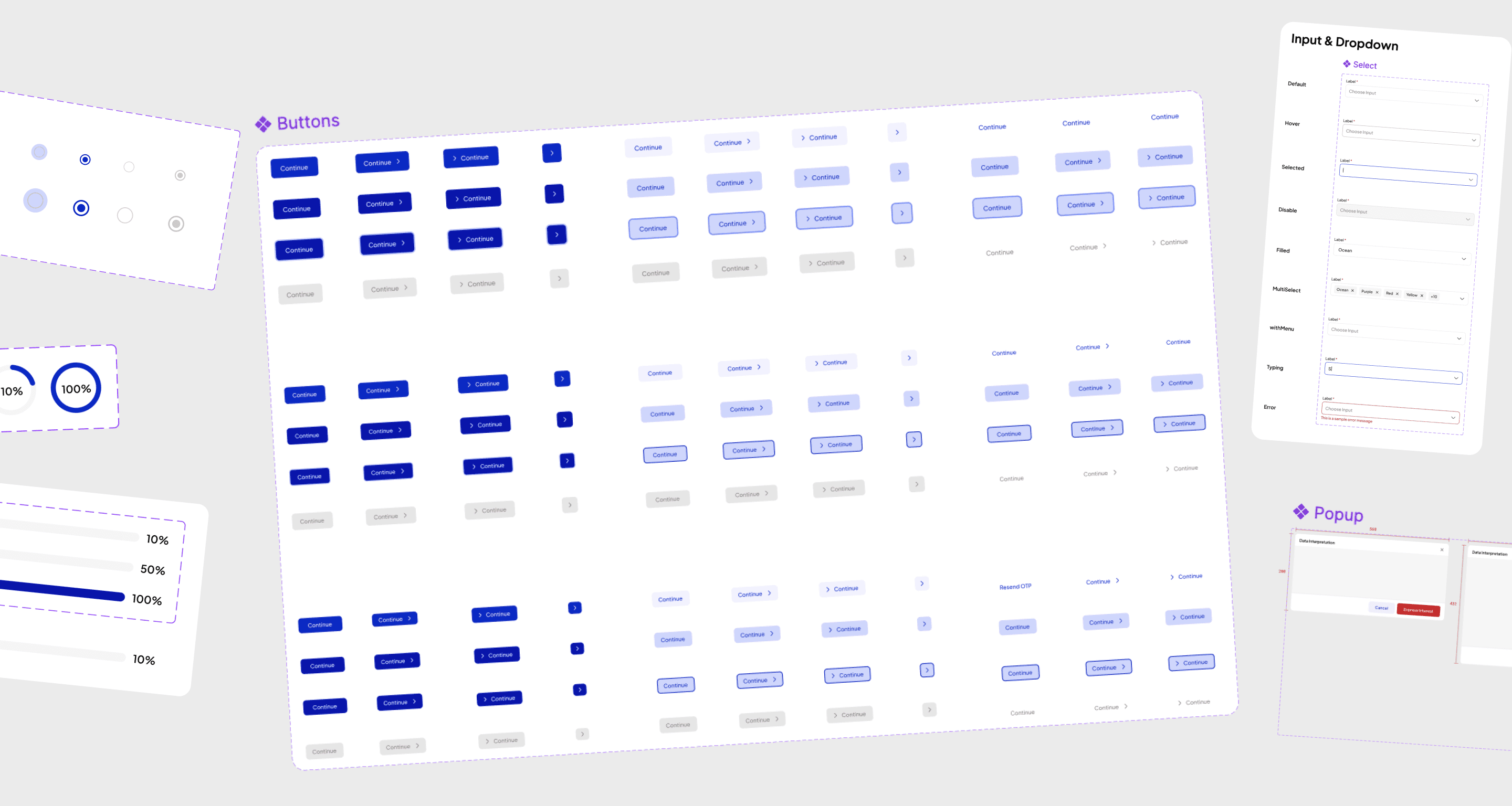
6) Building a Robust Design System!!

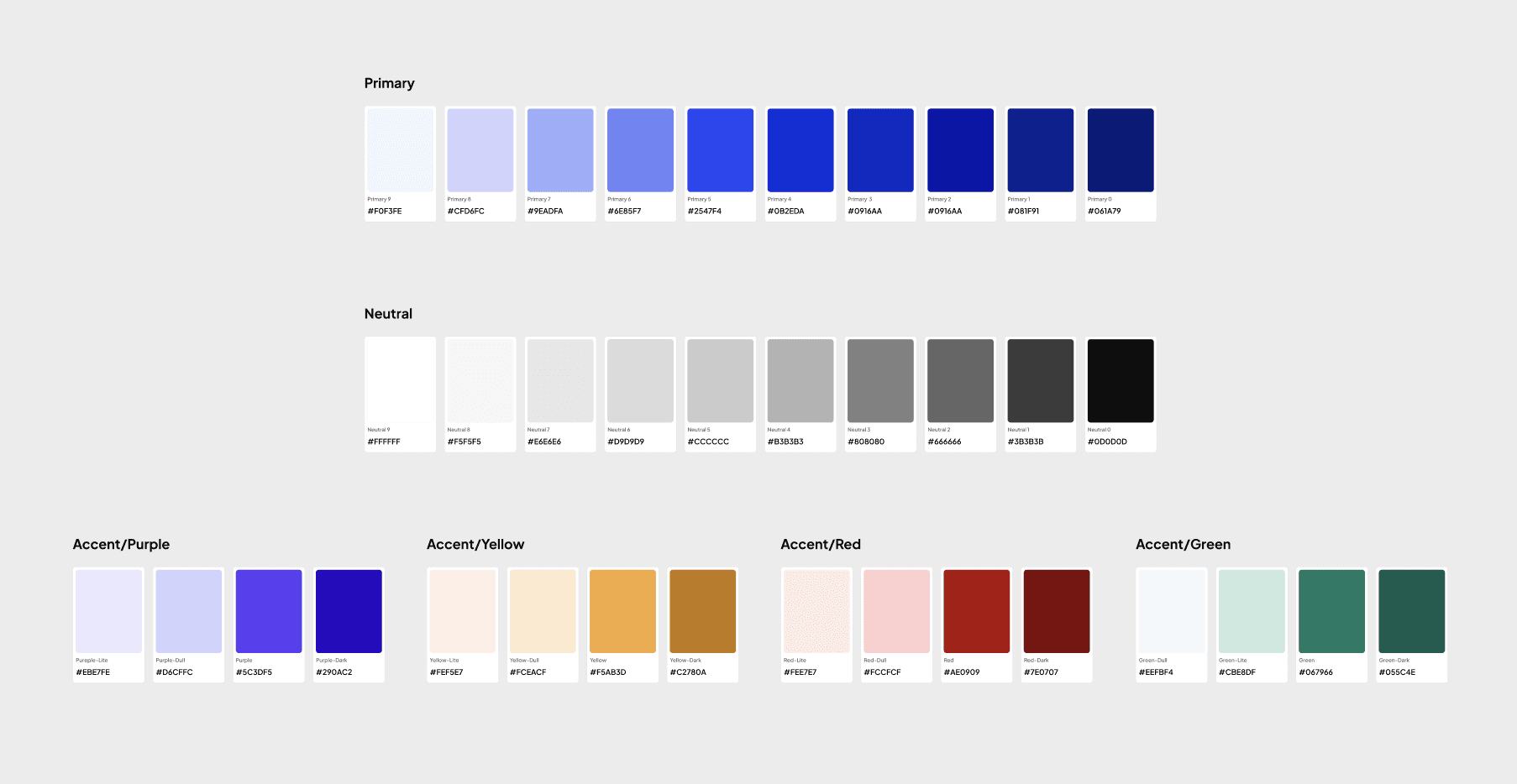
Starting with Colors
Keeping things basic.. I created shades of the colors and keep it simple.
The most important part of design, Typography!!
Have sat with developers to define the breakpoints for typography and use variables to define it in Figma!
Sitting with Developers to figure out the Breakpoints for typography!!

Defining Breakpoints in Figma Variables & Modes for making design responsive easily!
Building & Defining Components
It wasn't perfect but as a solo designer I tried to make the best out of my time!
Related Case Studies
I created a platform where you can train AI models, have a look!

Building a platform where next-gen AI models get trained by humans!
SAAS
Product Design
AI Annotation Tool
Designing a platform where AI get's trained, where users or annotators from Soul AI onboard and work on training AI models and training a AI model in much complex topics like mathematics, physics, along with training on multiple Indian languages.
